
Delfi Meedia AS koondab Eesti meediamaastiku ajalehtede ja ajakirjade lipulaevu ning haldab kõige mitmekülgsemat veebimeedia portfelli. Lisaks on meie ambitsioon pakkuda meeldejäävaid elamusi, mis tekitaksid ühiskonnas kõneainet. Oleme podcastide turuliider, kattes palju erinevaid valdkondi.
Me teenime demokraatiat. Delfi Meedia kaasabil on Eesti avatud, informeeritud ja digitaalselt arenenud ühiskond. Seda toetab meie faktipõhine ajakirjandus, kiirus ja kvaliteet meie igapäevases töös, julgus algatada uusi initsiatiive, küsida raskeid küsimusi, uurida sügavuti, olla samal ajal terav ning kirglik. Meie töötajaid ühendab usk pidevasse arengusse, mida väljendab tugev tung pidevalt kasvada ja katsetada.
Meie teenime demokraatiat.
Meie kaasabil on Eesti avatud, informeeritud ja digitaalselt arenenud ühiskond.
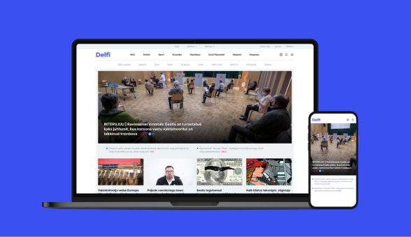
Eesti suurim uudisteportaal, mis koondab kokku Eesti 11 tippväljaande sisu ning kust leiab kõige kiirema ülevaate päeva põletavamatest teemadest – nii poliitikas, spordis kui ka meelelahutuses toimuvast.
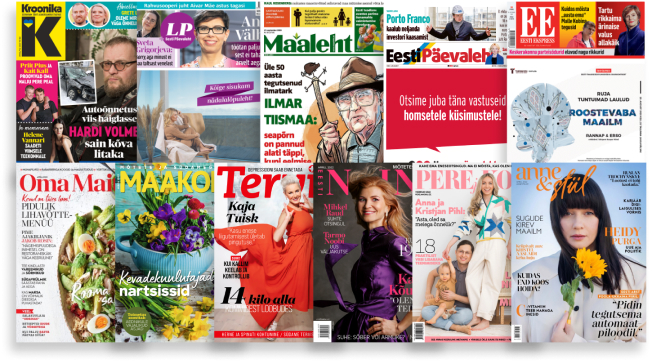
Anname välja mitmeid erinevaid ajalehti, ajakirju ning vahelehti, kajastades kõige olulisemat ja aktuaalsemat. Nii katame ära võimalikult laia sihtrühma, pakkudes neile huvipakkuvat sisu.
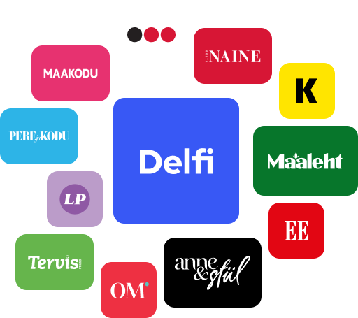
Meie meediabrändide seast leiab erinevaid populaarseid podcast’e, saateid, üritusi, ajakirju, ajalehti, vahelehti ning loomulikult seda kõike koondava Delfi.
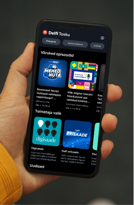
Delfi on podcast’ide valdkonna turuliider Eestis. Meil on üle 50 erineva saateformaadi, mida juhivad meie professionaalsed ajakirjanikud ning hoolikalt valitud koostööpartnerid pakkudes lugejatele ja kuulajatele parimat sisu.

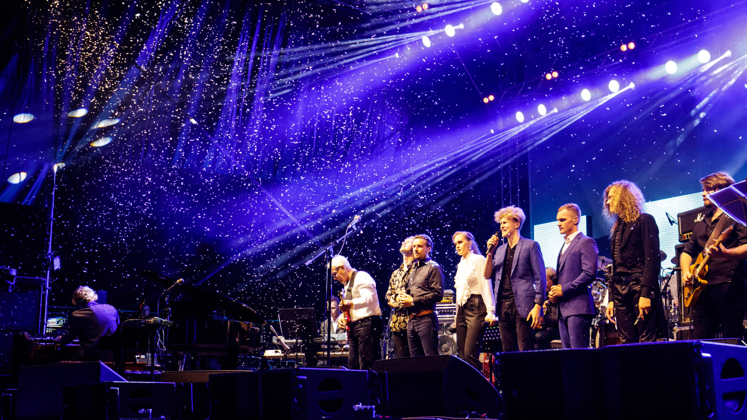
Meie ambitsioon on pakkuda Eesti kvaliteetseima ja mitmekülgseima ajakirjanduse kõrval meeldejäävaid ja emotsionaalseid üritusi, mis tekitaksid ühiskonnas kõneainet ning võimalusel toetaksid mõne valdkonna väljapaistvust Eestis.
Delfi Meedia on alustanud ettevõtte keskkonnamõjude tuvastamise ning nende vähendamise tegevuste planeerimisega. Meil on oluline, et meie töö parendaks mitte ei kahandaks inimeste elukvaliteeti ja rahulolu.

AS Ekspress Grupi tütarettevõttena kanname vastutust oma äritegevuse eest. Eetilised äritavad on alati olnud Ekspress Grupi ja meie äritegevuse lahutamatu osa. Meie eesmärk on säilitada läbipaistvat ärikeskkonda ning viia oma tegevust ellu vastutustundlikult ja eetiliselt.